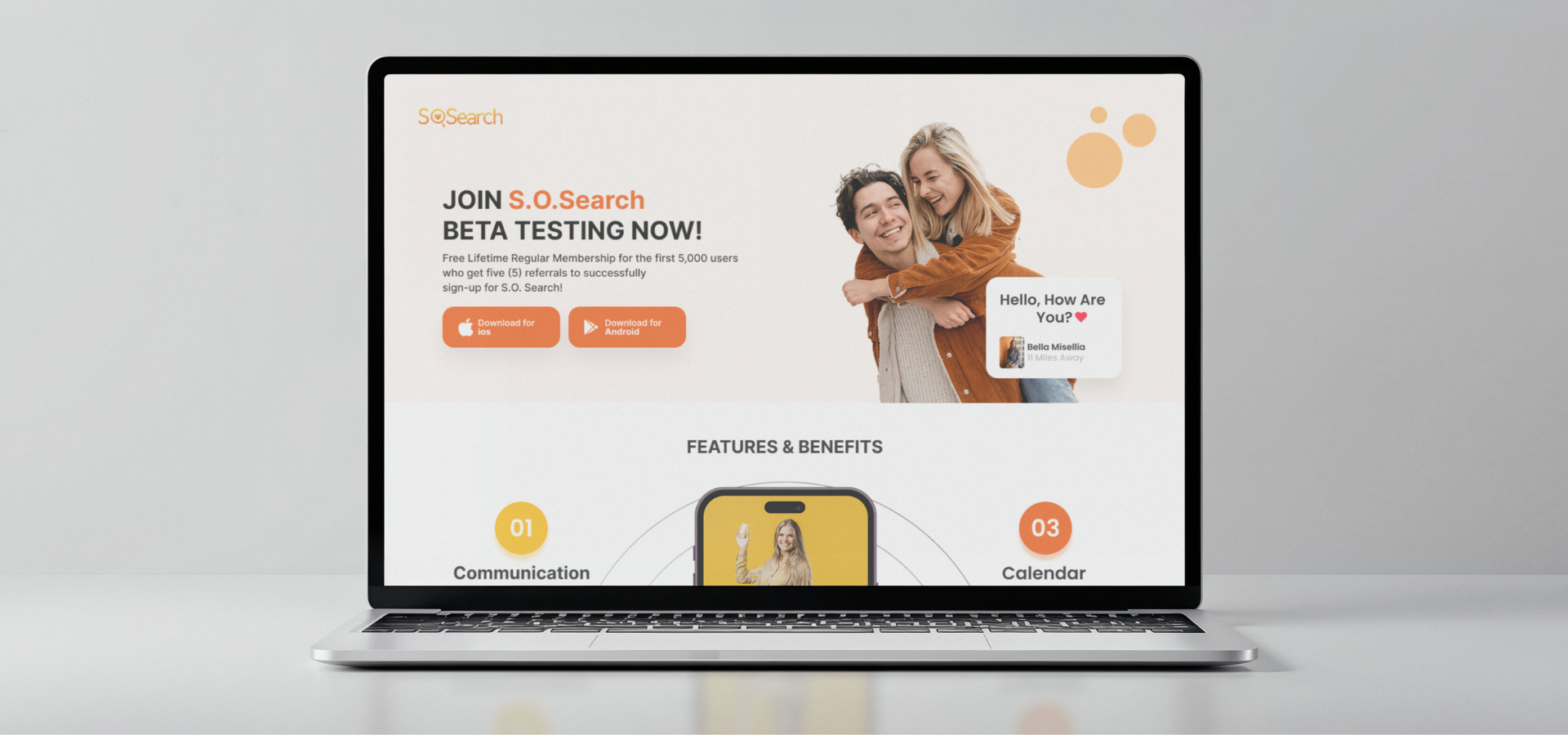
SOS – Landing Page
Overview
Significant Other Search (SOS) is a dating application designed to help you find and connect with your ideal significant other.
Role
Product Designer – User Research, Visual Design, Interaction and Prototype
Tool Kit
Adobe XD, Adobe Illustrator and Adobe Photoshop
The Problem
Significant Other Search (SOS) is a dating app concept that needed a clear and engaging landing page to explain what the app is about. Without a central place to introduce its purpose and features, users could easily feel confused about what SOS offers and why they should try it. This made it harder to build trust and encourage sign-ups. Creating a simple, user-friendly landing page was essential to clearly communicate the app’s value and make a strong first impression.
The Solution
To clearly introduce Significant Other Search (SOS) and encourage user sign-ups, I designed a simple and engaging landing page that communicates the app’s purpose and value at a glance. The goal was to make it easy for users to understand what SOS offers and feel confident exploring the app further.
The final solution includes:
- A clear hero section that explains what SOS is and who it’s for.
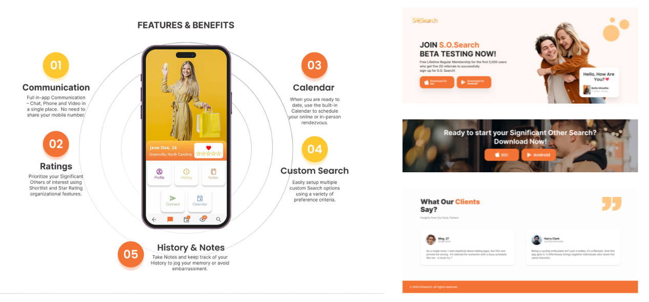
- Feature highlights that showcase how the app helps users find meaningful connections.
- Strong call-to-actions (CTAs) to encourage downloads or early sign-ups.
- A clean, modern visual style that feels approachable and trustworthy.
- A responsive layout to ensure a smooth experience across devices.
This landing page serves as a strong first touchpoint for SOS, helping build credibility, generate interest, and guide users toward taking action.
The Process
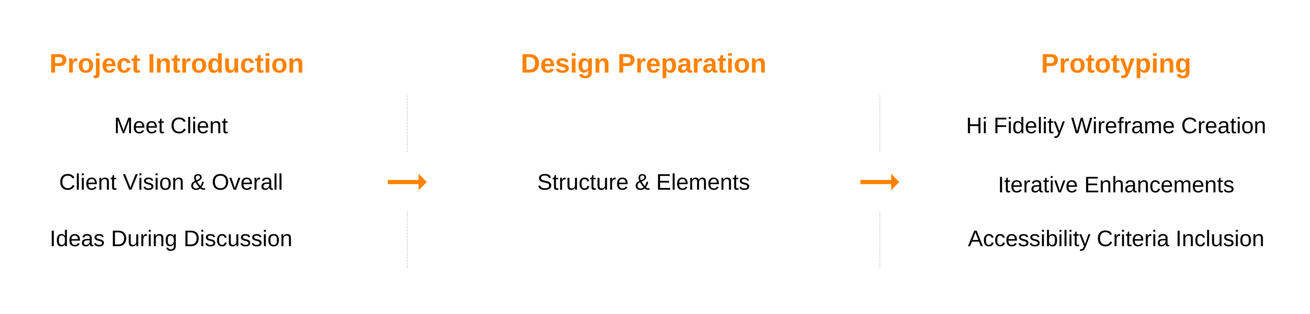
Developing the Designs
Starting with Structure
I began by mapping out the main screens directly in high-level frames to quickly explore layout ideas. This helped me define the hierarchy between apps, user actions, and admin tools early in the process.
Building Around Key Actions
With the structure in place, I focused on designing around the core user tasks—creating users, assigning access, and managing apps. I shaped the interface to make these actions easy to access and clearly grouped by function.
Designing with Components
To stay consistent and efficient, I created reusable components for buttons, input fields, modals, and table layouts. This helped speed up the design process and ensured a unified look across the platform.
Prototyping the Flows
I created an interactive prototype that walked through major user flows, like adding someone to a group or modifying access in a specific app. This helped stakeholders understand the experience and gave me a way to test flow clarity early on.
Refining for Clarity and Function
After rounds of feedback, I refined the design with close attention to spacing, alignment, and clarity. I made sure everything felt clean and intuitive—especially since the platform needed to support admin users working across many tools.
Key Takeaways
1. Designing with clarity helps reduce complexity
Focusing on simple, intuitive layouts made it easier to organize complex features like user permissions and app management. A clear structure helped users complete tasks faster and with more confidence.
2. Early prioritization of user actions pays off
By designing around the actual tasks admins needed to do, the interface stayed purposeful and functional. It kept the experience lean and focused without unnecessary distractions.
3. Reusability speeds up workflow
Creating a consistent set of components early in the process helped streamline the design phase and made scaling the UI across different screens more efficient.
4. Prototyping opened up better feedback
An interactive prototype allowed stakeholders to experience the product flow firsthand. This led to more helpful feedback and faster alignment on improvements.
5. Consistency across apps builds user trust
Keeping design patterns consistent throughout the platform made it easier for users to manage multiple tools. This improved usability and gave the interface a more professional, reliable feel.