Six Foot Guys
Overview
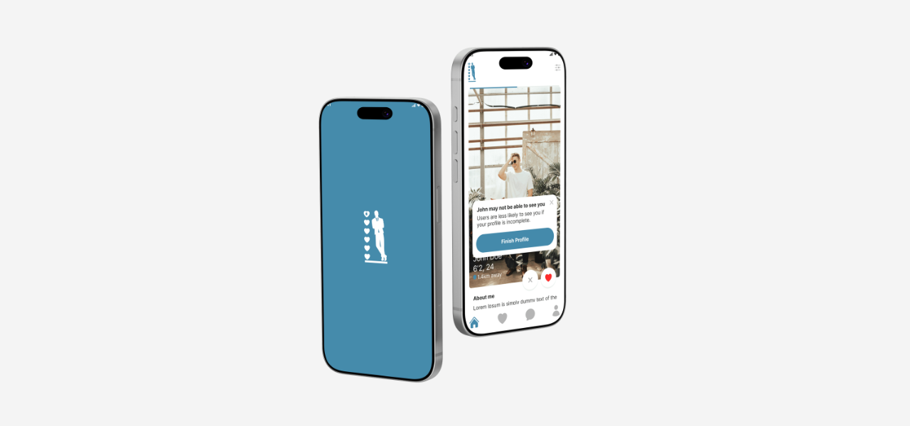
Six Foot Guys is a dating app designed for women who prefer to connect with taller men and for men who are six feet tall or above. The platform creates a more focused dating experience by helping users match based on a preference that is often difficult to filter for clearly on general dating apps.
Users can create a profile, specify their height, browse potential matches, and start conversations with people who share their dating preferences.
Role
Product Designer – User Research, Visual Design, Interaction and Prototype
Tool Kit
Figma, Adobe Illustrator and Adobe Photoshop
The Problem
Many dating apps serve a wide range of preferences, which can make it difficult for users with specific criteria to find compatible matches efficiently. For women who prefer taller partners, height can be an important factor, but it is often unclear, inconsistently shown, or not prioritized in the matching experience.
This can lead to time-consuming browsing and less relevant matches for both users.
The Solution
The solution was to design a focused dating app that makes height a clear and transparent part of the matching experience. Six Foot Guys allows men who are six feet tall or above to create profiles and helps women discover potential matches based on this preference.
The interface keeps browsing, matching, and messaging simple while maintaining a welcoming and trustworthy dating experience.
The Process
Components
Designing the Experience
Starting with Structure
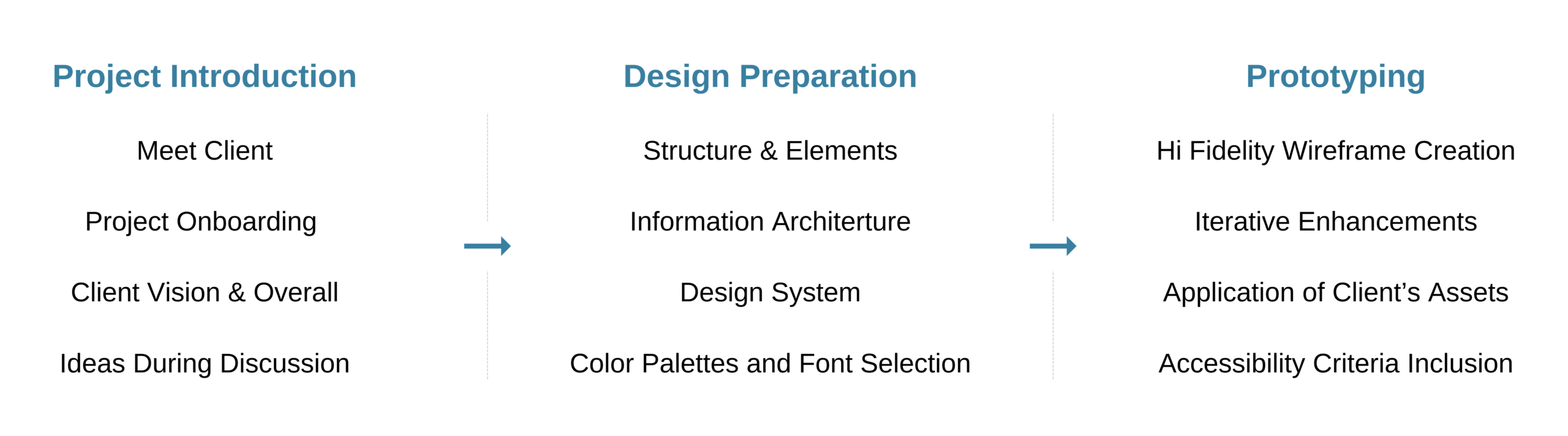
I began by organizing the key screens around the most important user actions: setting up a profile, browsing potential matches, viewing profiles, and starting conversations.
Making Preferences Clear
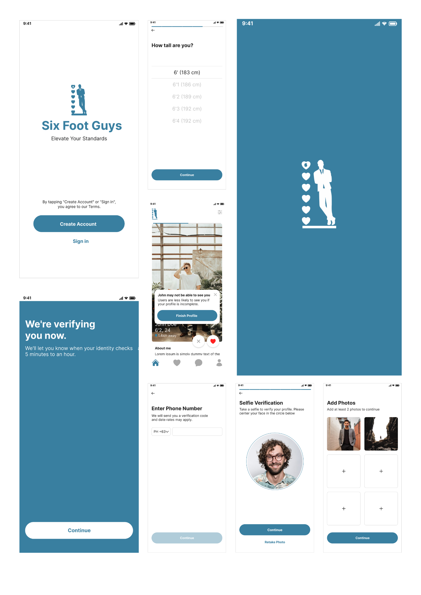
Height was designed as a visible profile detail so users can quickly understand whether a match aligns with their preference. This keeps the browsing experience focused and reduces unnecessary back-and-forth.
Designing for Discovery
The discovery screen uses clear profile cards with essential information, including photos, name, age, height, and a short bio. Users can quickly browse profiles and decide whether they are interested in connecting.
Creating a Simple Matching Flow
The matching flow was designed to feel familiar and easy to use. Users can like or pass on profiles, and mutual interest unlocks messaging so conversations begin only when both people choose to connect.
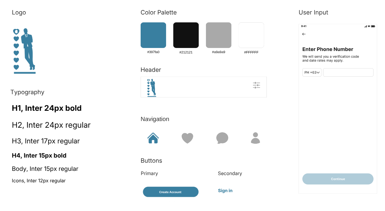
Designing with Components
A reusable component system helped maintain a unified visual language across profile setup, discovery, matches, and chat screens. It also made the app easier to scale as additional features are introduced.
Prototyping Key Flows
I created an interactive prototype to demonstrate the core journey: creating a profile, browsing matches, viewing profile details, matching, and starting a conversation.
Refining for Clarity and Trust
The final designs focused on clear profile information, straightforward actions, and an approachable interface. These elements help make the app easy to navigate while supporting a more comfortable dating experience.
Key Takeaways
1. Designing for a focused audience creates relevance
Building around a specific dating preference makes the experience more direct and helps users find matches that better align with what they are looking for.
2. Clear profile details support faster decisions
Making key information easy to scan helps users browse more confidently and spend less time opening profiles that may not be relevant.
3. Familiar patterns make onboarding easier
Using recognizable dating-app interactions for browsing, matching, and messaging helps users understand the product quickly.
4. Trust matters in social platforms
Clear profiles, mutual matching, and simple account controls help create a more comfortable and intentional environment for users.
5. A consistent design system supports growth
Reusable components make it easier to maintain consistency as the app expands with more matching, profile, and communication features.